详细介绍:wpf之 Popup

前言
Popup 在WPF中用于创建浮动内容的控件,它显示在其他内容之上,常用于工具提示、弹出菜单等场景
1、IsOpen
指示是否显示控件,值为true显示控件,值为false不显示控件。
2、PlacementTarget
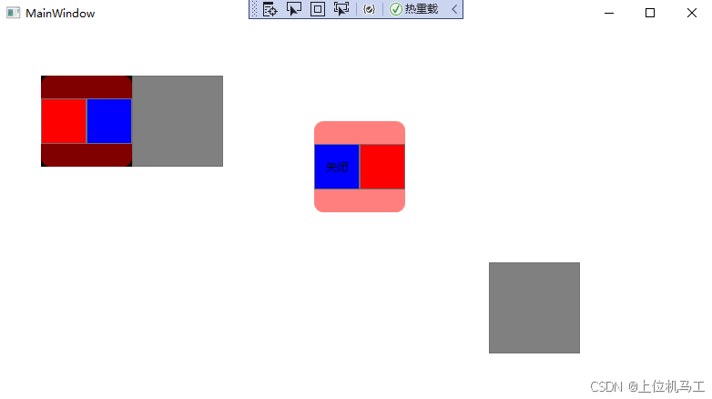
PlacementTarget 属性用于指定 Popup 相对于哪个控件进行定位,是控制 Popup 显示位置的关键属性,与 Placement 属性配合使用,下面的代码中指定Popup相对于btn1按钮定位,并且由于Placement="Left"所以是在btn1按钮的左边显示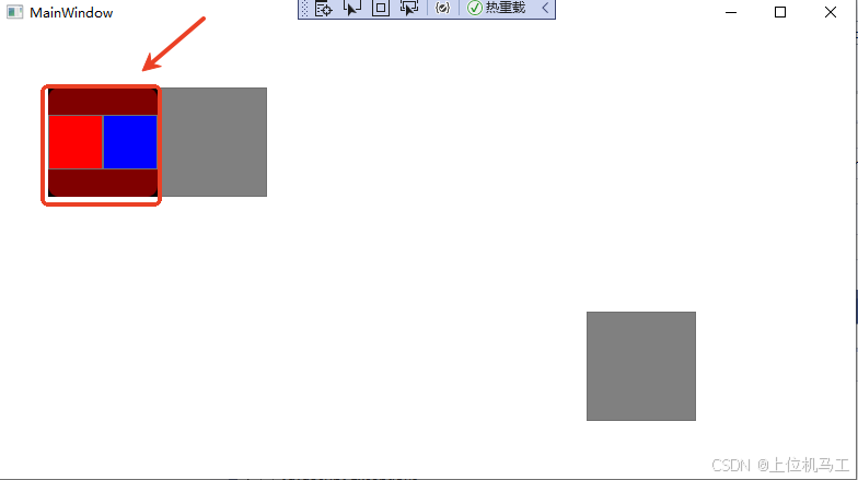
<Window x:Class="wpf之Popup.MainWindow"
xmlns="http://schemas.microsoft.com/winfx/2006/xaml/presentation"
xmlns:x="http://schemas.microsoft.com/winfx/2006/xaml"
xmlns:d="http://schemas.microsoft.com/expression/blend/2008"
xmlns:mc="http://schemas.openxmlformats.org/markup-compatibility/2006"
xmlns:local="clr-namespace:wpf之Popup"
mc:Ignorable="d"
Title="MainWindow" Height="450" Width="800">
<Grid><Grid.RowDefinitions><RowDefinition Height="1*" /><RowDefinition Height="1*" /></Grid.RowDefinitions ><Grid.ColumnDefinitions><ColumnDefinition Width=" *"/><ColumnDefinition Width="*"/></Grid.ColumnDefinitions><Button  x:Name="btn1"  Grid.Column=" 0" Grid.Row=" 0" Width="100"   Height=" 100" Background="Gray" Margin="3" Click="Button_Click"  HorizontalAlignment="Center" /><Button  x:Name="btn2"   Grid.Column=" 1" Grid.Row=" 1"   Width="100"   Height=" 100" Background="Gray" Click="Button_Click_1"   HorizontalAlignment="Center"/><Popup x:Name="pop_test1"  IsOpen="false" PlacementTarget="{Binding ElementName=btn1}" Placement="Left" StaysOpen="True"       AllowsTransparency="False"   PopupAnimation="None"  FlowDirection="LeftToRight" ><Border Background="#80FF0000" CornerRadius="10" Width="100" Height="100"><StackPanel Grid.Row=" 0" Orientation="Horizontal"  ><Button Width=" 50" Height=" 50" Background="Red"   /><Button Width=" 50" Height=" 50"  Background="Blue"   /></StackPanel ></Border></Popup ></Grid></Window>
3、Placement
指示Popup相对于PlacementTarget指定的控件的放置位置。
1)Absolute
相对于屏幕左上角定位
下面的代码指定Popup在距离屏幕左上角水平方向100(HorizontalOffset=“100”) ,垂直方向200(VerticalOffset=“200”)的位置显示。
<Window x:Class="wpf之Popup.MainWindow"
xmlns="http://schemas.microsoft.com/winfx/2006/xaml/presentation"
xmlns:x="http://schemas.microsoft.com/winfx/2006/xaml"
xmlns:d="http://schemas.microsoft.com/expression/blend/2008"
xmlns:mc="http://schemas.openxmlformats.org/markup-compatibility/2006"
xmlns:local="clr-namespace:wpf之Popup"
mc:Ignorable="d"
Title="MainWindow" Height="450" Width="800">
<Grid><Grid.RowDefinitions><RowDefinition Height="1*" /><RowDefinition Height="1*" /></Grid.RowDefinitions ><Grid.ColumnDefinitions><ColumnDefinition Width=" *"/><ColumnDefinition Width="*"/></Grid.ColumnDefinitions><Button  x:Name="btn1"  Grid.Column=" 0" Grid.Row=" 0" Width="100"   Height=" 100" Background="Gray" Margin="3" Click="Button_Click"  HorizontalAlignment="Center" /><Button  x:Name="btn2"   Grid.Column=" 1" Grid.Row=" 1"   Width="100"   Height=" 100" Background="Gray" Click="Button_Click_1"   HorizontalAlignment="Center"/><Popup x:Name="pop_test1"  IsOpen="false"  Placement="Absolute"   HorizontalOffset="100" VerticalOffset="200" StaysOpen="True"       AllowsTransparency="False"   PopupAnimation="None"  FlowDirection="LeftToRight" ><Border Background="#80FF0000" CornerRadius="10" Width="100" Height="100"><StackPanel Grid.Row=" 0" Orientation="Horizontal"  ><Button Width=" 50" Height=" 50" Background="Red"   /><Button Width=" 50" Height=" 50"  Background="Blue"   /></StackPanel ></Border></Popup ></Grid></Window>
2)Relative
相对于指定的矩形左上角定位,矩形的坐标的原点在窗体的左上角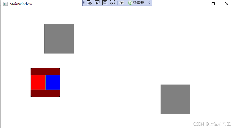
下面的代码指定popup在矩形(PlacementRectangle=“100,200,1000,1000” )指定的距离窗体左边100,上边200的位置显示。
<Window x:Class="wpf之Popup.MainWindow"
xmlns="http://schemas.microsoft.com/winfx/2006/xaml/presentation"
xmlns:x="http://schemas.microsoft.com/winfx/2006/xaml"
xmlns:d="http://schemas.microsoft.com/expression/blend/2008"
xmlns:mc="http://schemas.openxmlformats.org/markup-compatibility/2006"
xmlns:local="clr-namespace:wpf之Popup"
mc:Ignorable="d"
Title="MainWindow" Height="450" Width="800">
<Grid><Grid.RowDefinitions><RowDefinition Height="1*" /><RowDefinition Height="1*" /></Grid.RowDefinitions ><Grid.ColumnDefinitions><ColumnDefinition Width=" *"/><ColumnDefinition Width="*"/></Grid.ColumnDefinitions><Button  x:Name="btn1"  Grid.Column=" 0" Grid.Row=" 0" Width="100"   Height=" 100" Background="Gray" Margin="3" Click="Button_Click"  HorizontalAlignment="Center" /><Button  x:Name="btn2"   Grid.Column=" 1" Grid.Row=" 1"   Width="100"   Height=" 100" Background="Gray" Click="Button_Click_1"   HorizontalAlignment="Center"/><Popup x:Name="pop_test1"  IsOpen="false"  Placement="Relative"   PlacementRectangle="100,200,1000,1000" StaysOpen="True"       AllowsTransparency="False"   PopupAnimation="None"  FlowDirection="LeftToRight" ><Border Background="#80FF0000" CornerRadius="10" Width="100" Height="100"><StackPanel Grid.Row=" 0" Orientation="Horizontal"  ><Button Width=" 50" Height=" 50" Background="Red"   /><Button Width=" 50" Height=" 50"  Background="Blue"   /></StackPanel ></Border></Popup ></Grid></Window>
3)Bottom
结合PlacementTarget使用,靠下显示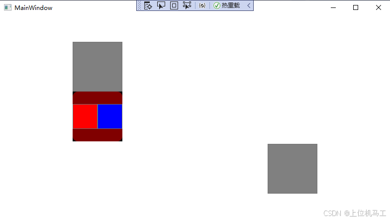
4)Top
结合PlacementTarget使用,靠上显示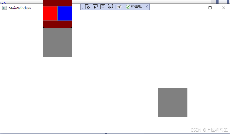
5)Left
结合PlacementTarget使用,靠左显示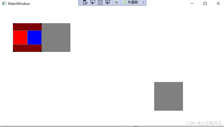
<Popup x:Name="pop_test1" IsOpen="false" PlacementTarget="{Binding ElementName=btn1}" Placement="Left" StaysOpen="True" AllowsTransparency="False" PopupAnimation="None" FlowDirection="LeftToRight" ><Border Background="#80FF0000" CornerRadius="10" Width="100" Height="100"><StackPanel Grid.Row=" 0" Orientation="Horizontal" ><Button Width=" 50" Height=" 50" Background="Red" /><Button Width=" 50" Height=" 50" Background="Blue" /></StackPanel ></Border></Popup >6)Right
结合PlacementTarget使用,靠右显示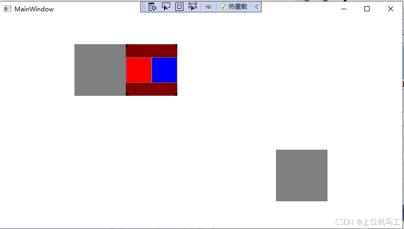
7)Center
结合PlacementTarget使用,居中显示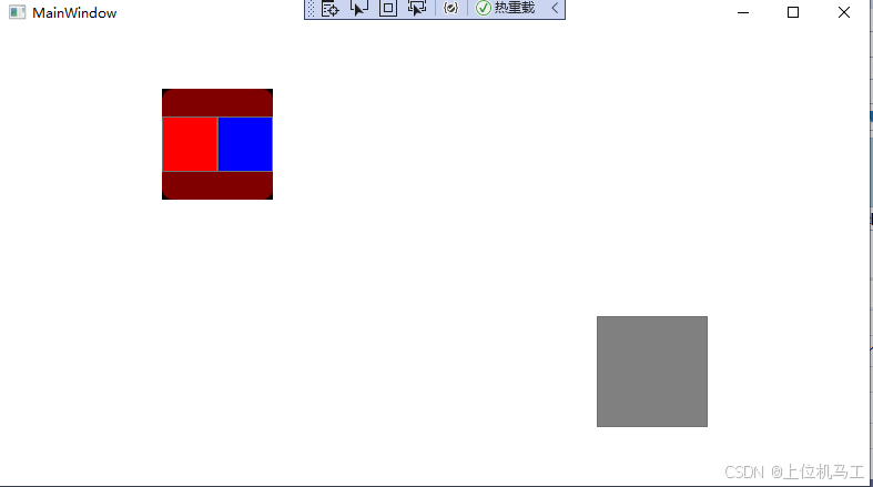
8)Mouse
根据鼠标位置决定,不需要结合PlacementTarget使用
9)MousePoint
根据鼠标点击位置决定,不需要结合PlacementTarget使用
<Popup x:Name="pop_test1" IsOpen="false" Placement="MousePoint" StaysOpen="True" AllowsTransparency="False" PopupAnimation="None" FlowDirection="LeftToRight" ><Border Background="#80FF0000" CornerRadius="10" Width="100" Height="100"><StackPanel Grid.Row=" 0" Orientation="Horizontal" ><Button Width=" 50" Height=" 50" Background="Red" /><Button Width=" 50" Height=" 50" Background="Blue" /></StackPanel ></Border></Popup >10)AbsolutePoint
4、StaysOpen
StaysOpen 决定了 Popup 是"临时性"的还是"持久性"的显示。
1)true
则为永久性显示,需要通过代码关闭Popup控件。
2) false
则为临时显示,当点击 不是Popup控件所显示的区域时,Popup控件不再显示。
5、AllowsTransparency
指示Popup控件是否支持透明色
1)true
支持透明色
2)false
不支持透明色
6、PopupAnimation
指示Popup控件显示时的动画,比如滑动显示
7、FlowDirection
指示Popup控件中的子控件的排列方式,比如从左到右还是从右到左。
综合应用
<Window x:Class="wpf之Popup.MainWindow"
xmlns="http://schemas.microsoft.com/winfx/2006/xaml/presentation"
xmlns:x="http://schemas.microsoft.com/winfx/2006/xaml"
xmlns:d="http://schemas.microsoft.com/expression/blend/2008"
xmlns:mc="http://schemas.openxmlformats.org/markup-compatibility/2006"
xmlns:local="clr-namespace:wpf之Popup"
mc:Ignorable="d"
Title="MainWindow" Height="450" Width="800">
<Grid><Grid.RowDefinitions><RowDefinition Height="1*" /><RowDefinition Height="1*" /></Grid.RowDefinitions ><Grid.ColumnDefinitions><ColumnDefinition Width=" *"/><ColumnDefinition Width="*"/></Grid.ColumnDefinitions><Button  x:Name="btn1"  Grid.Column=" 0" Grid.Row=" 0" Width="100"   Height=" 100" Background="Gray" Margin="3" Click="Button_Click"  HorizontalAlignment="Center" /><Button  x:Name="btn2"   Grid.Column=" 1" Grid.Row=" 1"   Width="100"   Height=" 100" Background="Gray" Click="Button_Click_1"   HorizontalAlignment="Center"/><Popup x:Name="pop_test1"  IsOpen="false" PlacementTarget="{Binding ElementName=btn1}" Placement="Left" StaysOpen="False"      AllowsTransparency="False"   PopupAnimation="None"  FlowDirection="LeftToRight" ><Border Background="#80FF0000" CornerRadius="10" Width="100" Height="100"><StackPanel Grid.Row=" 0" Orientation="Horizontal"  ><Button Width=" 50" Height=" 50" Background="Red"   /><Button Width=" 50" Height=" 50"  Background="Blue"   /></StackPanel ></Border></Popup ><Popup x:Name="pop_test2"  IsOpen="false" PlacementTarget="{Binding ElementName=btn1}" Placement="Right"   HorizontalOffset=" 100" VerticalOffset=" 50" StaysOpen="True" AllowsTransparency="True"  PopupAnimation="Slide "    FlowDirection="RightToLeft" ><Border Background="#80FF0000" CornerRadius="10" Width="100" Height="100"><StackPanel Grid.Row=" 0" Orientation="Horizontal"  ><Button Width=" 50" Height=" 50" Background="Red"   /><Button Width=" 50" Height=" 50" Content="关闭" Background="Blue" Click="Button_Click_2"   /></StackPanel ></Border></Popup ></Grid></Window>